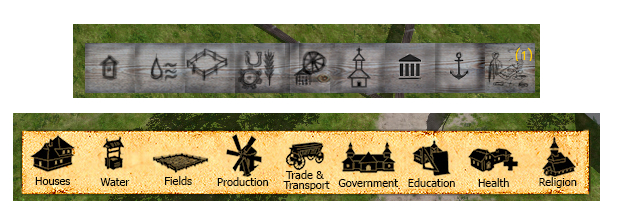
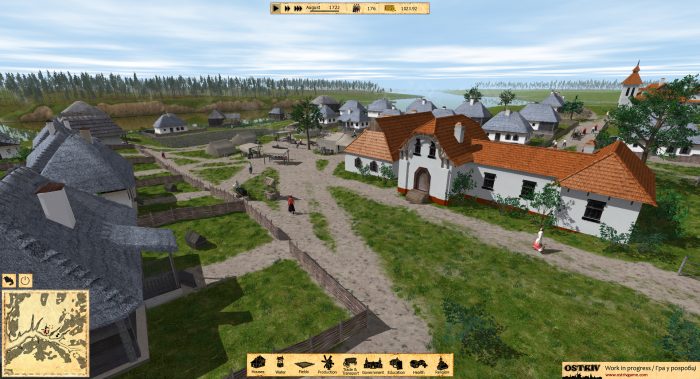
Today I’ve updated all gallery images to reflect the current state of the development. The graphics improved a lot in last couple of weeks. A basic clouds functionality added, improved grass textures, improved and optimized shadows resolution, and the most important: there’s now a basic UI visible on screenshots. Actually it was in game for long time, but the look of it was telling me not to show it to anyone:) But now that the decent version is ready, I can show you both to compare:

I think the difference is pretty obvious:) Still I think I’ll need to do some more fine-tuning.
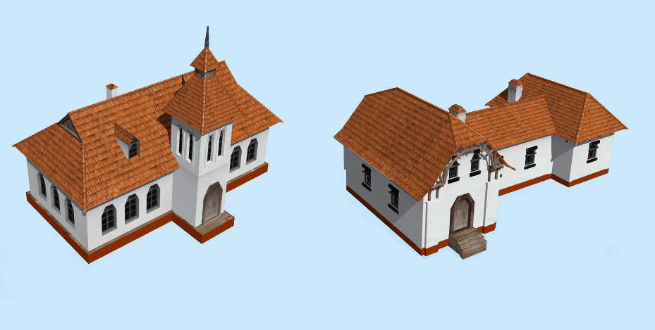
As always, a lot of models stepped to the next level of completeness. Here are two of my favorite:

The left one is a school and on the right is a hospital. Later I’ll explain how all the education and healthcare system work in game.
Meanwhile my promotion work is becoming a part of the project. Some time before I thought that one just need to make a good game and that’s enough. Even though I received nothing but positive comments on game, I still feel like almost no one knows about it. Now it’s obvious for me that it’s really tough task to get your game noticed among the endless flow of information, wich is part of our life nowadays. The more you throw in that flow, the more chance you have to get noticed. Little by little the community is growing.
So I really appreciate if you could spread the word among people, who might be interested in city-building games. And don’t forget about my Facebook, Twitter, and IndieDB page.
That’s all for now. My next milestone is gameplay video. So now I’ll need to put some effort to make everything look good in motion. You should have seen that awesome wagon physics:)
